Taking Variable Fonts for a Spin
It's been a minute since they were introduced, but I finally took some time to see how variable fonts stack up to their static counterparts. At least for my own blog, it was worth the effort.Every so often, I reencounter a web technology I nearly forgot existed. Not because it's old, but because it's so new and lacking in browser support that it's not worth my attention.
One of them is variable fonts. After being first introduced in 2016, I just realized they have really solid browser support all these years later. Google Fonts even started to roll out filtering by variable versions back in 2020. That's like a generation ago in web years, so I figured it was time to give them a shot.
And it was pretty good timing. Since moving this site over to Astro (a great move, by the way), I'd been relying on system fonts, but I've meaning to switch over to something else. This was a good reason to see whether variable fonts provide enough benefit for your average bro's nerd blog – not just in terms of the typographical power, but also performance. Fonts are critical to a website, but they can also be hefty and complicated to use effectively. If variable fonts offer help on this front, I'm in.
Establishing a Baseline
For this dabbling, I chose to work with Open Sans. It's a widely used font and readily available in both variable and static versions from Fontsource, the provider I'm using.
Rather than splitting hairs over the weights an average site would use, I just decided to go with the full gamut. I don't think I use them all on my site, but between headings, subheadings, body copy, and the weird stuff I do in-between, it's close enough.
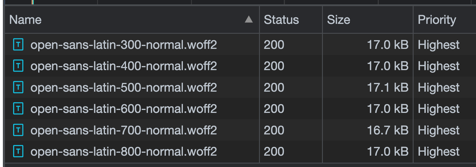
On the first pass, I loaded only the standard styles. No italic versions. It queued up an HTTP request for every individual weight, each coming in at around 17kb. It's more than I'd like to load (which is zero), but nothing crazy at this point.
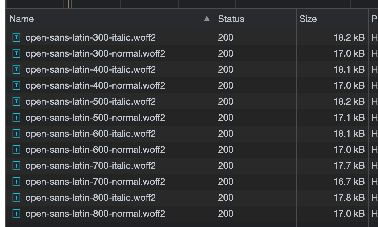
Loading the italic versions is where things got gross. It doubled both the HTTP request count and the asset size, totaling over 200kb of added page weight. Blegh.
Again, the average site (probably) doesn't need all of these. But if you're working with anything over a moderately complex blog, it's really hard to determine which ones to exclude. Instead, it's easier on one's sanity to just load them all. There'll be more page weight, but at least you won't unexpectedly find some text lacking the correct font face.
Giving Variable a Shot
Switching over to the variable version of Open Sans was fairly straightforward, at least when doing so with Fontsource. Rather than importing all of those different files, it was reduced to just two. One for "normal" variations in weight, and one for italic. I'm loading them directly within a .astro file, so it looked like this:
@import '@fontsource-variable/open-sans';
@import '@fontsource-variable/open-sans/wght-italic.css';
I also needed to tweak the font-family rule, noting that I'm using the "Variable" version:
body {
  font-family: 'Open Sans Variable', sans-serif;
}
But that was it. Simple switch, and I liked what I saw in the network tab.
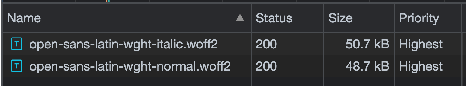
Less than half of what I was previously loading, and only two HTTP requests. Plus, those two files include every possible variation I'd ever need. Less cost, more value.
Unfortunately, it's not so easy for fonts that aren't hot & ready from providers like Fontsource.
Be wary of just any variable font.
Open Sans is slick, but I wanted to use something different for my production site: Inter. And since the project's easily accessible on GitHub (including a variable version), I thought I'd try my hand at wiring things up from scratch, rather than relying on Fontsource. But this decision turned out to be a smidge more complicated.
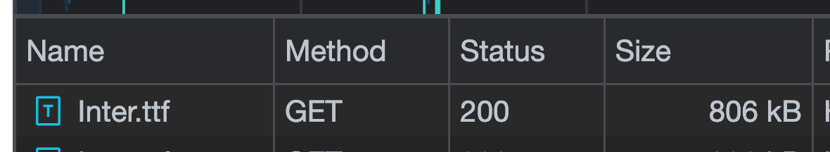
Because of how flexible variable fonts can be, building them can mean those versions are significantly larger than you might expect, especially when they're not exclusively packaged for use on the web. When I loaded the entire variable version of Inter, it came to over 800kb of added weight. 😱😱😱
After reading into a bit more, it made some sense. That variable font contains every possible variation of several dimensions and a whole ton of glyphs I'll never use. I took it straight from the Inter project itself, which isn't optimized for web-specific use (including the format – .woff2 is typically the best format for fonts on the web these days).
But I wasn't out of luck, thanks to a great article from Trevor Harmon, which references another from Michael J. Harold. These two introduced me to the idea of subsetting fonts (removing unneeded glyphs) and reformatting the file to .woff2 for even better compression.
With their help, I used pyftsubset, a command line tool for subsetting fonts and spitting out the result in a given format.
pyftsubset Inter.tff \
  --unicodes="U+0020-007F,U+00A0-00FF,U+0100-017F,U+2192" \
  --layout-features="" \
  --flavor="woff2" \
  --output-file="inter-subset.woff2"
As instructed by the article, that'll rip out any glyphs other than what's needed to write a blog post. And the result was satisfying:
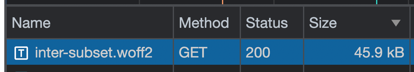
Down from over 800kb to 45.9kb. And only one HTTP request my site needs to take on. I accept.
Variable for Everything?
In the short-term, probably not for everything. Browser support certainly isn't an issue, but the font faces I'd like when building a site aren't always available in a variable version. If I'm really keen on using a particular font, I'll either need to scourge the internet for a variable version and possibly mess with more subsetting, or settle for a static version that's ready to go. The latter is way easier.
Long-term, however, it might be more likely. The rate at which variable versions are available & web-ready from common sources (Fontsource, Google Fonts, etc.) is rapidly increasing (at least anecdotally). For example, I wanted to use Karla for PicPerf.dev, and was very happy to see a variable version offered by Fontsource, as was the case for several other options I was considering. And it just worked. No problems.
The part of variable fonts I'm more concerned with is my ability to use them effectively. There's a whole new world of CSS properties, technical concepts, and more out there on variable fonts that I'm not remotely familiar with. If I'm going to leverage them beyond the potential performance benefits, I'll need to spend some more time in the weeds as time goes on. And that's fine with me, because it'll probably produce fodder for more blog posts.
Get blog posts like this in your inbox.
May be irregular. Unsubscribe whenever.