We'll soon be able to slide open a `height: auto` box with native CSS.
Using JavaScript or other creative tricks to animate open a box with unknown contents will soon be a thing of the past. Let's tinker with two new approaches native to CSS.
A couple weeks ago, I wrote about using JavaScript and forced reflows to slide open a box with an unknown amount of content (i.e. "height: auto"). It’s satisfying to understand how to pull it off and why it works. But at the same time, we know in our bones that the approach is more cumbersome than it needs to be. It's a capability that ought to exist natively in CSS, alongside the rest of the animation tooling that's been baked into the language for years now.
I guess that reality is closer than I thought. In fact, there are two ways to slide a box from zero to “height: auto” coming to native CSS (and they're already in Chromium-based browsers!).
We'll get to that. First, a reminder of what it took to slide such a box centuries ago. You might've reached for JavaScript:
<style>
#box {
  height: 0;
  overflow: hidden;
  transition: height 1s;
}
</style>

<script>
const openButton = document.getElementById('openButton');
const box = document.getElementById('box');

openButton.addEventListener('click', () => {
  // Close the box after forcing a reflow.
  if (box.clientHeight > 0) {
    box.style.height = '0px';
    return;
  }

  box.style.height = 'auto';
  const targetHeight = box.clientHeight;
  box.style.height = `0px`;

  // Force a reflow to trigger the animation.
  box.offsetHeight;

  box.style.height = `${targetHeight}px`;
});
</script>
There's a lot of not-so-obvious stuff going on there, namely, the forced, synchronous reflows that need to be precisely triggered by accessing a particular DOM property (clientHeight). Tools like the Web Animations API smooth out the task a little, but even that is surprisingly painful to get simple back-and-forth sliding working in a way that can handle unpredictable user behavior. For a taste of that, see what I had to do with slide-element. Ain't pretty.
CSS was technically on the table as well. Animating grid-template-rows in CSS Grid gets you the desired output, but even that requires more setup than feels appropriate, and isn't something I'd consider "intuitive."
Sliding w/ calc-size()
Two upcoming CSS features will ease all that pain. First, look at calc-size(), a new function that allows you to do math with intrinsic size keywords like auto. The function's result is animatable (word?) by default, so this is all we need:
<style>
  #box {
    height: 0;
    overflow: hidden;
    transition: height 1s;
  }

  #box.is-open {
    height: calc-size(auto, size);
  }
</style>

<script>
  const openButton = document.getElementById('openButton');
  const box = document.getElementById('box');

  openButton.addEventListener('click', () => {
    box.classList.toggle('is-open');
  });
</script>
That's significantly and objectively more intuitive, and it handles animation interruptions nicely too. Try toggling this box rapidly a few times:
See the Pen Blog :: calc-size() Demo by Alex MacArthur (@alexmacarthur) on CodePen.
Let's dissect calc-size(auto, size) a bit:
The first argument is the calc-size-basis. You can think of it as the "starting size" value you're about to operate on. It doesn't need to be an intrinsic size, but since the classic calc() doesn't support such values, it'll probably be common to for calc-size() to be the go-to for handling them.
The second argument is actually an expression – the formula you'll use to crank out a resulting value. In our example, calc-size(auto, size), all we're doing is returning itself. If your brain runs on JavaScript, think of it like this:
const sizeBasis = `the derived size of "auto"`;

function calculate(size) {
   return size;
}

const result = calculate(sizeBasis);
But that could get as complex as needed. Such as:
calc-size(max-content, round(up, size, 50px) + 20px);In JavaScript, our calculation expression would look like...
const sizeBasis = `the derived size of "max-content"`;

function calculate(size) {
  const roundedValue = Math.ceil(base / 50) * 50;

  return roundedValue + 20;
}

const result = calculate(size);
It's fine if you're thinking that's way more math power than you'd ever want at your disposal. This function was designed to do math. But if you strictly want to enable animating to intrinsic sizes, you're in luck.
Sliding w/ interpolate-size
It'll soon be possible to switch on intrinsic size animations for a part of the document, or even the entire page. By slapping the interpolate-size property on an ancestor element, everything in its scope will be opted in. No other changes necessary.
<style>
  :root {
    /**
    Everything in :root can now animate
    intrinsic size keywords.
    **/
  interpolate-size: allow-keywords;
  }

  #box {
    height: 0;
    overflow: hidden;
    transition: height 1s;

    &.is-open {
      height: auto;
    }
  }
</style>

<script>
  const openButton = document.getElementById('openButton');
  const box = document.getElementById('box');

  openButton.addEventListener('click', () => {
    box.classList.toggle('is-open');
  });
</script>
That's it. Those auto animations will now just work:
See the Pen Blog :: calc-size() Demo by Alex MacArthur (@alexmacarthur) on CodePen.
The allowed-keywords value of that property refers to those aforementioned intrinsic size keywords. It's just a smarter way of indicating you can animate between a fixed size and an indeterminate one, using those keywords you see all over – auto, fit-content, max-content, etc.
The design of this property is very intentional, by the way. Since it would impact the behavior of a lot of websites out there, it's not enabled by default. But given how useful it is, I'd say it's a good idea to set it & forget it in greenfield projects. It's already being put into CSS resets out there, so you can expect adoption to be a no-brainer.
Dealing w/ Browser Support
Browser support is not great for both interpolate-size and calc-size (basically just Chromium). But if you're really itching to be cutting-edge, you do have a couple options.
First, you could use the CSS @supports at-rule to do feature detection, defining fallback behavior for the 30-something% of visitors who'll need it:
#box {
  overflow: hidden;
  height: auto;
  max-height: 0;
  transition: height 1s;

  @supports (interpolate-size: allow-keywords) {
    height: 0;
    max-height: none;
    transition: height 1s;
  }

  &.is-open {
    max-height: 500px;

    @supports (interpolate-size: allow-keywords) {
      max-height: none;
      height: auto;
    }
  }
}
There are obviously some trade-offs to consider. That example falls back to a max-height hack, but you could also opt to let the box snap open instantly.
If you prefer to keep everything in JavaScript, you could also use the CSS.supports() static method available in the browser. Maybe you'd fallback to the old-school way of sliding:
openButton.addEventListener("click", () => {
if (CSS.supports("interpolate-size", "allow-keywords")) {
box.classList.toggle("is-open");
return;
}
slideTheOldSchoolWay();
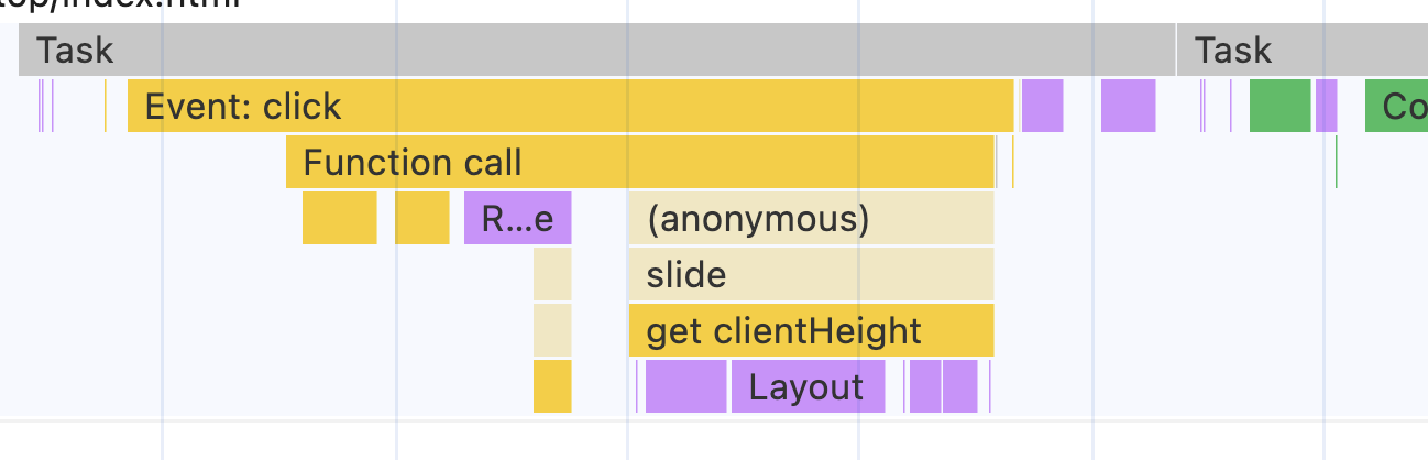
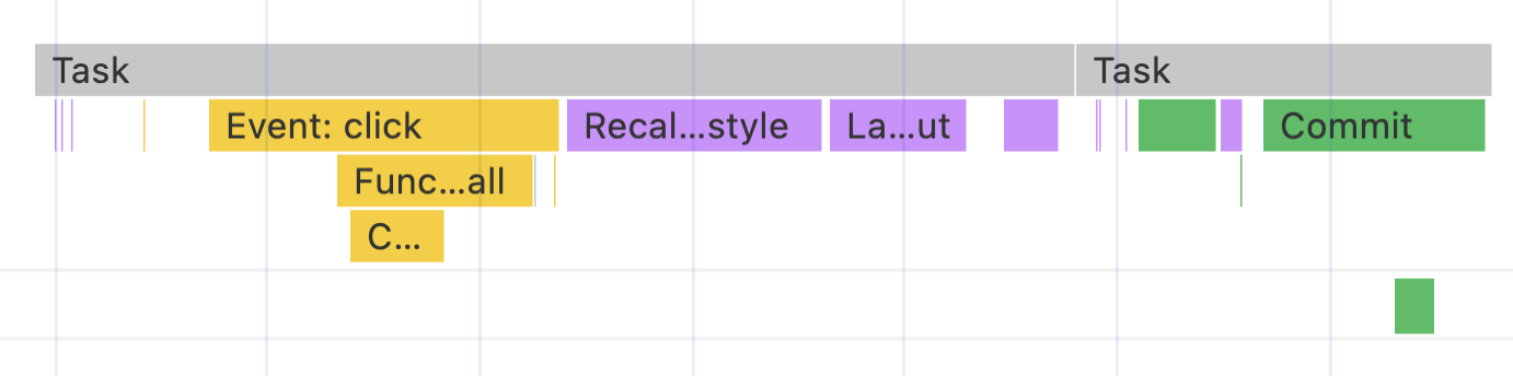
});One benefit here is that it's simple to remove that fallback when browser support becomes adequate. And even more, there seems to be a modest performance benefit for most users. Main thread activity at least looks a little quieter when you do get the opportunity to leverage native CSS.
Here's a performance snapshot from the old-school approach. It took that click event handler about .38ms to completely execute.
Compared to the native CSS approach, which took about .16ms. The improvement makes sense – there are no forced, synchronous reflows to deal with this time around.
Those comparisons are anything but scientific, but I do think they confirm a long-held principle: if you want to keep the thread clean and snappy, execute less JavaScript. That's what progressive enhancements like this do.
Sliding w/ No JavaScript At All
The extra interesting thing about these new properties is the fact that they makes it possible to animate such a box without a single byte of JavaScript. You might know what's coming: the hidden checkbox trick.
If you haven't used it, here's the idea: Put a checkbox and associated label in your HTML. Hide the checkbox and treat the label as a button. Then, use the :checked pseudo-class to style each state. Like this:
<button>
<label for="checkbox">Open</label>
</button>
<input type="checkbox" id="checkbox" />
<div id="box">
A bunch of content...
</div>
<style>
:root {
interpolate-size: allow-keywords;
}
#box {
height: 0;
overflow: hidden;
transition: height 0.25s;
}
#checkbox {
display: none;
&:checked + #box {
height: auto;
}
}
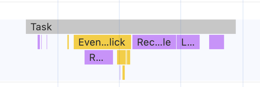
</style>That's really it. No JavaScript, but we get the same, smooth behavior as before:
See the Pen Blog :: interpolate-size Demo by Alex MacArthur (@alexmacarthur) on CodePen.
Now, there's even less activity on the main thread. This click event took 93 microseconds for the browser to process. Nice.
All of this merely scratches the surface of use cases for these new features – my head's just been focused on sliding boxes as of late. I'm looking forward to see what other problems this new era of CSS feature support is poised to solve, and how quickly we can safely forget about all the tricks we've had to lean on until now.
Tangentially related: remember floats and clearfixes? Those were the days.
Get blog posts like this in your inbox.
May be irregular. Unsubscribe whenever.